Let’s Be on the Same Page About Your Brand Colours
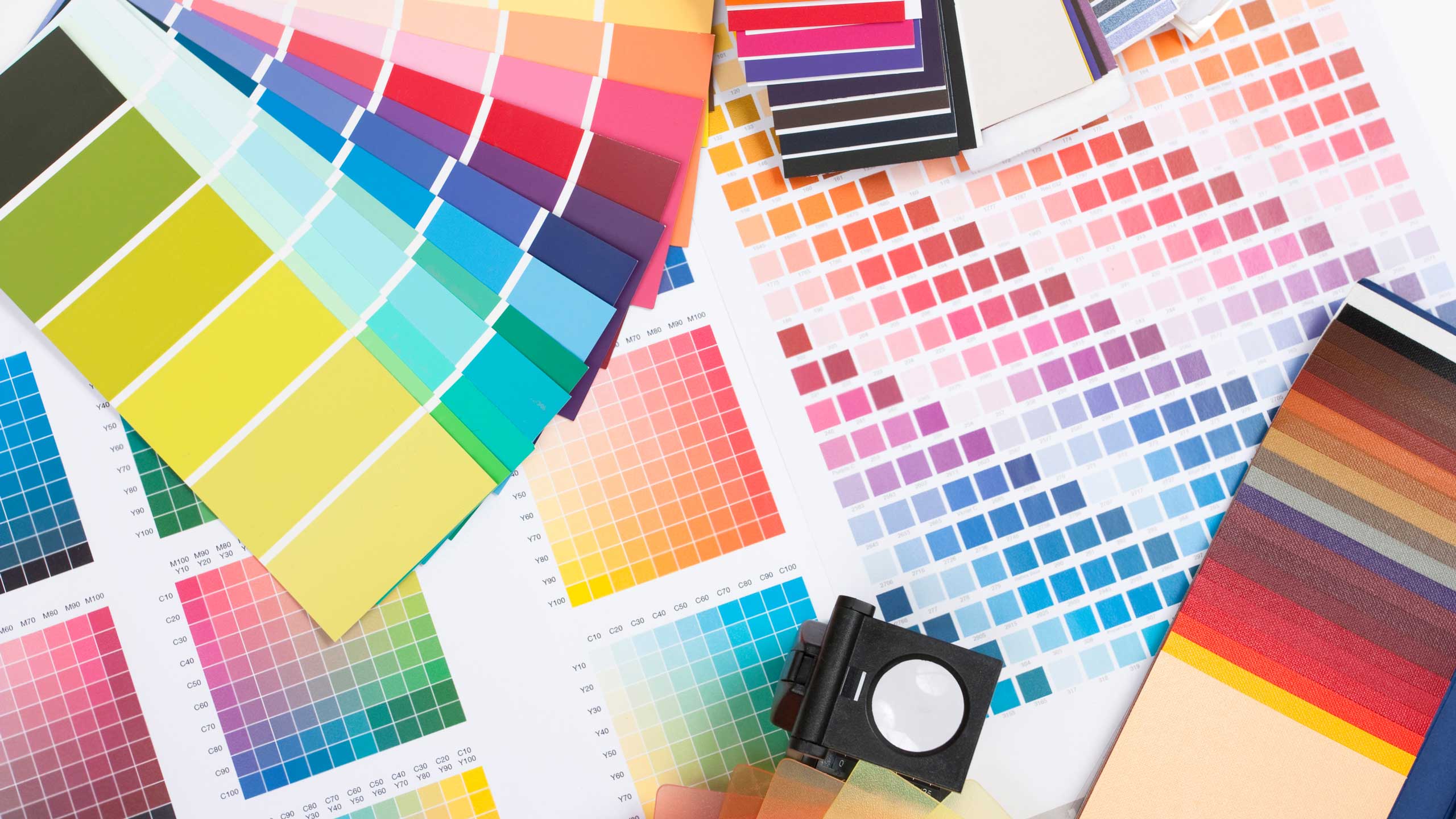
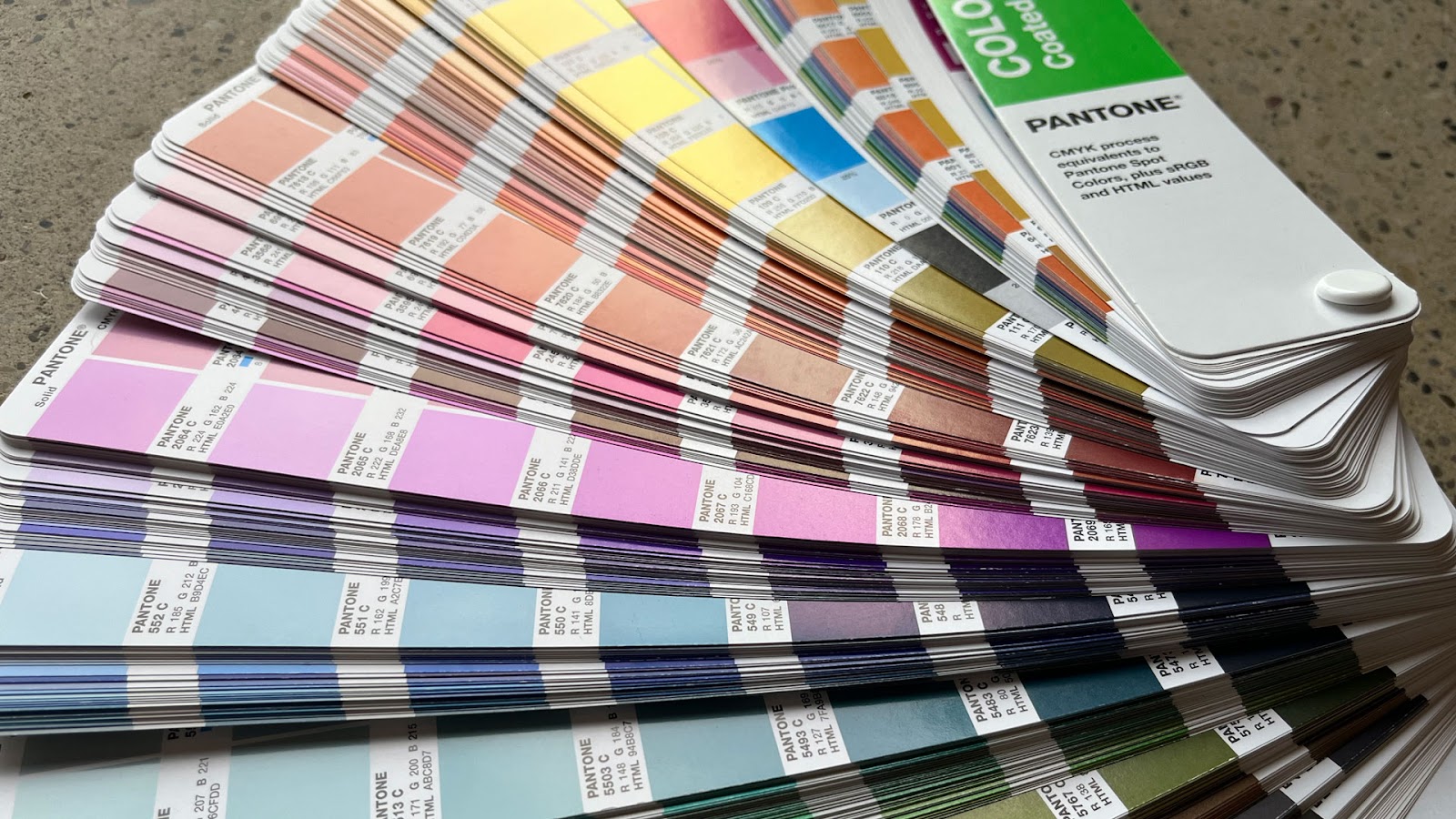
What colour, exactly, is Seafoam Green? Is your idea of Aquamarine Blue the same as mine? Or do you get confused between Teal and Turquoise? If one of the most important things in branding is consistency, then how do we ensure we are consistently using the same brand colour across various mediums? One of the industry standard tools we use at KEEN is the Pantone Matching System.
What Is Pantone and the Pantone Matching System?
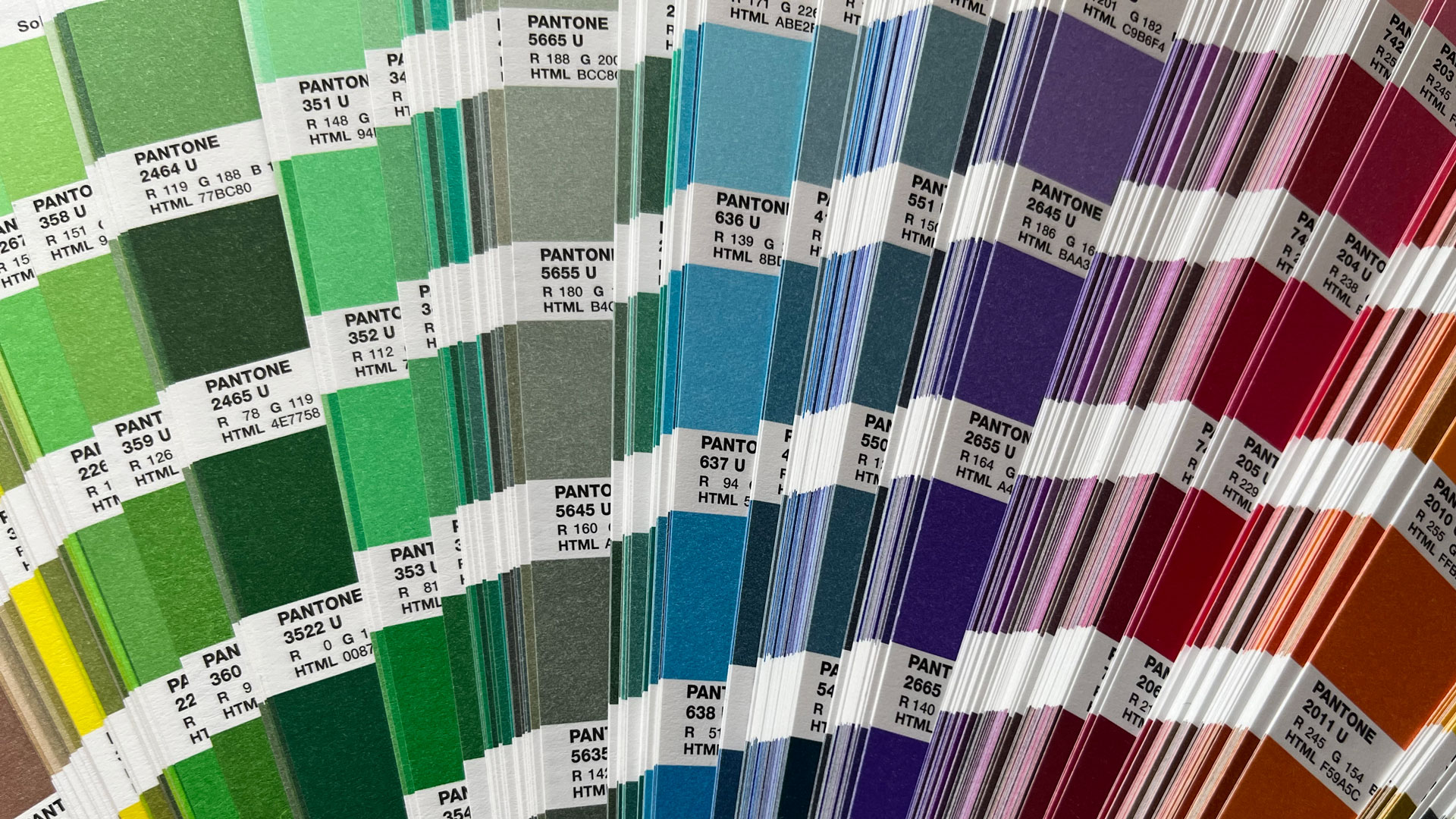
A Pantone colour is a specific, specialized ink colour, created by a company called Pantone. There’s a whole rainbow of different Pantone colours. What makes Pantone particularly valuable is that it has developed the Pantone Matching System (or “PMS”), which is essentially a colour communication and translation system. More about that later…
A Brief History of the Pantone Matching System
Imagine it’s the 1960s and you’re looking on the store shelf for some Kodak film. There are varying shades of yellow boxes to choose from. Some are bright, sunny yellows, while others are duller. Which box do you choose? Naturally, you reach for the most vibrant yellow box of film because it seems “fresher” than the others.
This colour variation has nothing to do with “freshness” however, but is actually the result of the packaging being produced by multiple different printing companies. The different printers did not have a good, standardized way to ensure they all matched with each other, so would instead produce their own separate “Kodak yellow”. Many companies were experiencing this same colour inconsistency issue, and Pantone saw an opportunity in the market to create a standardized system. When the Pantone Matching System launched in 1963, it allowed companies to choose a specific colour that the printer would match to.
Pantone Versus CMYK
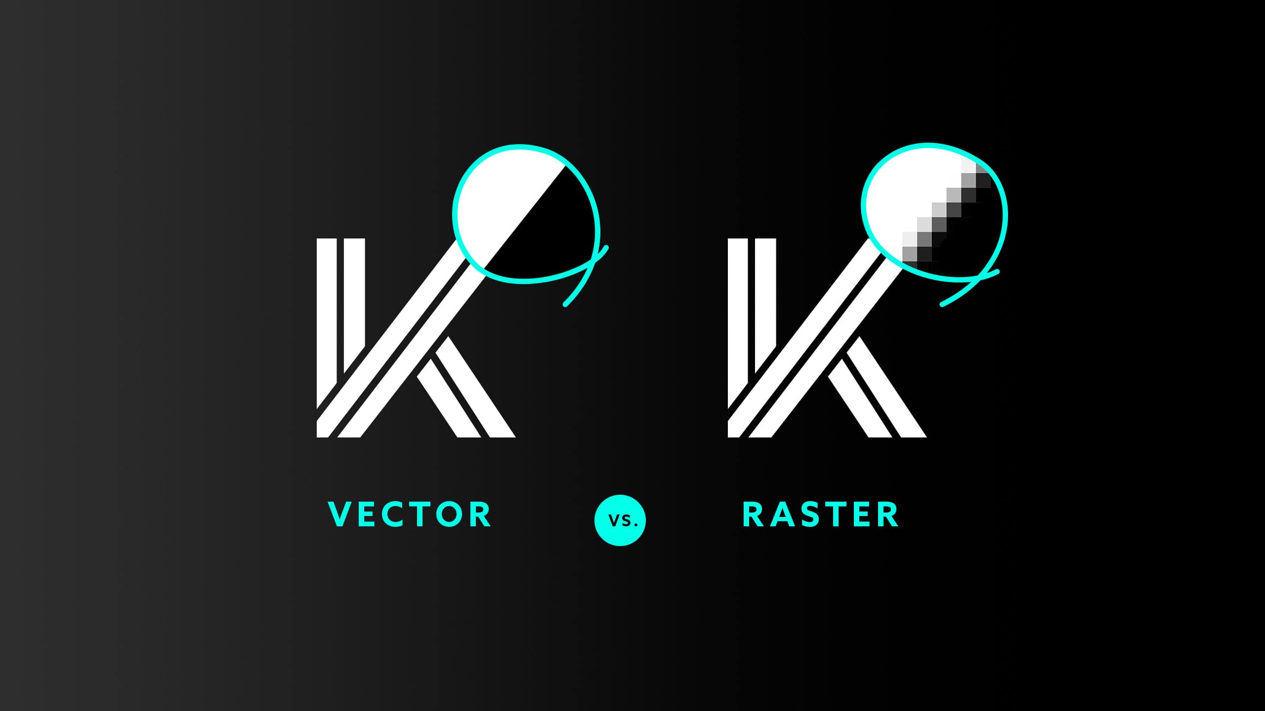
Nowadays, printing colour has become much more standardized. There’s technology for precisely measuring colour and calibrating ink output during printing to more accurately produce consistent colours. We also live in a world now that prints almost everything in a very standardized 4 colour process, also known as CMYK (Cyan, Magenta, Yellow and Key/Black) inks. These four ink colours can combine in various amounts to produce a large rainbow of colours, and is a much cheaper process than using Pantone.
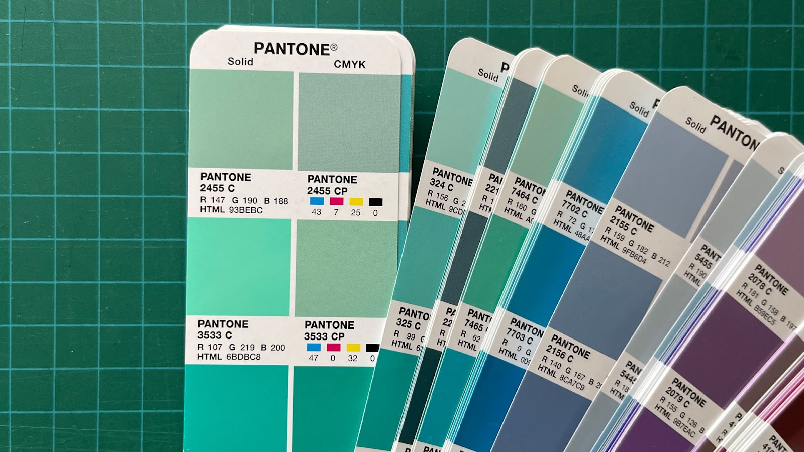
However, Pantone colors are sometimes outside the ‘gamut’ of CMYK printing, meaning they fall beyond the range of achievable colors using just cyan, magenta, yellow, and black inks. Since each Pantone ink is a specially premixed ink (called a “spot” colour), you can produce some colours that are impossible to translate into CMYK.
Why Use a Matching System?
You want your brand’s colours to look consistent, whether they’re printed, on a website, or embroidered on a jacket. A colour matching system — like the Pantone Matching System — helps ensure consistency by being a solid reference point to match to for any vendor that comes into contact with your brand. In addition, each Pantone colour has a corresponding CMYK and RGB code, allowing your brand’s colours to be translated into affordable CMYK printing, or the digital realm.
At KEEN Creative, we prioritize the Pantone Matching System when selecting brand colours, assuring that your chosen colours seamlessly transcend between various applications. The specific tools we use allow our designers to see how well a Pantone colour can translate into CMYK, so we can avoid any problematic ‘out of gamut’ colour translations, like we mentioned earlier in this blog.
This means Kodak Yellow STAYS Kodak Yellow, and not any other shade but Kodak Yellow. For you, and your brand, this means less guessing, across your whole team and the businesses and customers you interact with.
Want to learn more?
It’s impossible to dive into all the details and nuances of colour in just one blog post. Luckily KEEN has a talented team that can help you achieve consistency in everything your brand does, including its colour.